
Choosing the right Refuge Area Sign is more than selecting a symbol and placing it on a wall. Global buyers must consider visibility, language, contrast, mounting conditions, and local emergency guidance. A sign may look clear in a product photograph, yet appear weak under smoke, dust, glare, or low corridor lighting. Practical experience shows that small details matter. Letter height matters. So does viewing distance.
A reliable purchasing decision begins with the building itself. Is the sign for a high-rise stairwell, a public transport station, or an industrial facility? Each location creates different risks and installation requirements. Buyers should review recognized safety standards, accessibility expectations, and approval needs in the target market. Requirements can vary between countries and even between building authorities. Professional suppliers should provide material data, photometric information, test reports, and installation guidance. Claims should be checked, not simply trusted.
Do not ignore maintenance. A sign covered by dust or blocked by stored equipment cannot guide people effectively. Choose durable materials that suit humidity, temperature changes, cleaning routines, and indoor or outdoor exposure. Photoluminescent products may support visibility during power loss, but their performance depends on charging light and correct placement. This point is often underestimated.
No option fits every project. Even experienced buyers can overlook glare, viewing angles, or inconsistent symbols across a site. That deserves reflection. A thoughtful comparison, supported by site assessment and competent advice, helps create safer and more dependable emergency wayfinding for people from different languages and backgrounds.
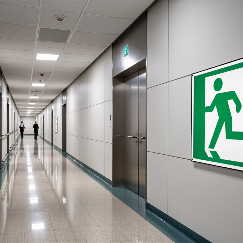
How to Choose the Right Refuge Area Sign for Global Buyers?
Defining a refuge area starts with classification, not decoration. ISO 7010 provides standardized safety sign meanings, colors, and pictograms for emergency communication. However, it does not offer one universal pictogram named “refuge area.” Buyers should select the closest approved meaning, such as an emergency exit, assembly point, or safe waiting location. The final choice depends on the building plan, evacuation strategy, and local requirements.
Clarity matters when smoke, noise, or stress reduces attention. The International Labour Organization estimated 2.93 million work-related deaths and 395 million non-fatal injuries globally in 2023. These figures show why signs must support real decisions quickly. Choose strong contrast, durable materials, and a viewing distance suited to corridors, stairwells, and outdoor zones. Add short local text only when the pictogram could be misunderstood. Translation alone is not enough.
Tips: Place the sign at eye level and repeat it before every decision point. Check visibility from wheelchair height, too. Use ISO 7010 references consistently across drawings and site inspections. Record the sign’s location, size, and maintenance schedule. A small mistake can remain invisible until an emergency. That deserves a second review. Some facilities may also need tactile or illuminated solutions, but these should match the evacuation design rather than replace it. Data source: International Labour Organization, A Call for Safer and Healthier Working Environments, 2023; ISO 7010 and ISO 3864 series.
| Selection Dimension | Recommended Refuge Area Sign Specification | ISO 7010 / ISO 3864 Classification | Why It Matters to Global Buyers | Buyer Verification Point |
|---|---|---|---|---|
| Sign purpose | Use the sign to identify a designated temporary refuge area where people who cannot immediately use stairs or evacuation routes may wait for assisted evacuation, when permitted by the local emergency plan. | Safety condition / escape and evacuation information sign. Use an officially registered ISO 7010 graphical symbol where the applicable national authority recognizes it. | A refuge area sign identifies a location; it does not replace an evacuation plan, fire strategy, emergency communication system, or accessibility provision. | Confirm that the location has been formally designated in the building’s fire and evacuation documentation. |
| Safety sign category | Select a safe-condition sign design rather than a warning, prohibition, mandatory-action, or fire-equipment sign. | ISO 7010 and ISO 3864 safe-condition signs generally use a green rectangular or square field with a white graphical symbol. | Correct classification improves recognition and prevents the refuge location from being confused with an alarm, fire extinguisher, or hazard area. | Check the background color, symbol color, shape, and contrast against the applicable edition of ISO 3864 and local regulations. |
| Graphical symbol | Use the exact registered graphical symbol for the intended refuge or assisted-evacuation function. Do not create a visually similar symbol without technical review. | ISO 7010 symbols are standardized graphical symbols; registration and symbol identification should be checked in the current official standard. | Symbol variations can reduce comprehension when products are used by multilingual occupants or installed in international facilities. | Request the symbol reference, revision information, and artwork approval from the responsible safety consultant or authority. |
| Supplementary text | Add concise text such as “REFUGE AREA” only when it improves local understanding or is required by the project specification. Keep the standardized symbol visually dominant. | Supplementary text is project- and jurisdiction-dependent; it should not alter the meaning of the standardized safety symbol. | Text supports local users, while the graphical symbol helps visitors and people who do not read the local language. | Use the required local language or bilingual wording, and verify legibility at the intended viewing distance. |
| Color and contrast | Use a high-contrast green-and-white safety sign with a clean, uncluttered layout. Avoid decorative colors, gradients, or low-contrast printing. | Safe-condition signs are associated with green and white under ISO 3864 safety-sign principles. | Consistent color coding supports rapid identification during smoke, stress, reduced visibility, or power interruptions. | Check color contrast, print consistency, and whether the surface remains readable under the project’s lighting conditions. |
| Viewing distance and sign size | Choose the sign size from the maximum viewing distance, viewing angle, mounting height, background clutter, and whether the sign must be seen through smoke or from a corridor junction. | ISO 3864-1 provides principles for safety-sign design and sizing. Exact dimensions should be calculated for the installation rather than selected by a universal size. | A sign that is technically compliant but too small may fail to guide occupants before they reach a decision point. | Record the longest viewing distance and obtain a scaled visibility review for corridors, open areas, stair lobbies, and approach routes. |
| Illumination | Use a normally illuminated sign where general lighting is reliable. Use an internally illuminated or photoluminescent solution only when it satisfies the project’s emergency-lighting and visibility requirements. | Emergency escape-route visibility is generally addressed through local building, fire-safety, and emergency-lighting requirements, including applicable provisions of ISO 30061 or regional equivalents. | Refuge locations must remain identifiable during a mains-power failure or emergency evacuation. | Confirm emergency power, charging time, luminance or afterglow performance, testing method, and maintenance access. |
| Directional arrows | Add directional signs before junctions, changes of direction, and level transitions. Use a separate directional sign when the refuge symbol alone does not show the route. | Directional elements should follow the relevant ISO 3864 design principles and the project’s approved evacuation-sign system. | A location sign without route guidance may leave occupants unable to find the refuge area from remote parts of the building. | Walk the complete route from each occupied area and verify that every decision point has clear guidance. |
| Mounting position | Mount the sign where it is unobstructed, visible from the approach route, and coordinated with doors, handrails, lighting, fire equipment, and accessibility features. | Mounting height and placement are normally determined by local building, accessibility, fire, and workplace-safety requirements. | Poor placement can hide the sign or create confusion with exit doors, stair identification, or other safety information. | Approve the location on the final evacuation drawings and inspect it after all interior finishes and equipment are installed. |
| Material and durability | Select a rigid, cleanable, fade-resistant substrate suitable for the environment. Use moisture-resistant construction in humid or semi-outdoor locations and impact-resistant construction in busy circulation areas. | Material selection is application-specific; fire behavior, durability, and electrical safety may be governed by local product and building requirements. | Environmental degradation can reduce contrast and visibility long before the sign is physically damaged. | Request cleaning, UV exposure, humidity, impact, and operating-temperature information appropriate to the installation site. |
| Accessibility and inclusive communication | Keep the sign visually clear and coordinate it with tactile, audible, communication, and assisted-evacuation measures where required. | ISO 7010 graphical signs support visual communication but do not by themselves provide a complete accessible evacuation system. | People with visual, hearing, mobility, or cognitive disabilities may require additional communication and assistance. | Review the sign and refuge-area plan with the project accessibility specialist and the building’s emergency-response team. |
| Regulatory approval | Treat ISO 7010 as a design reference and verify the final product against the destination country’s building, fire, accessibility, workplace, and product requirements. | International standards do not automatically replace mandatory national or regional regulations. | A sign accepted in one market may require different text, photoluminescent performance, testing, or installation details in another. | Obtain written confirmation from the local authority, fire engineer, code consultant, or project safety professional before mass production. |
It should identify a safe waiting or assisted evacuation location. One universal symbol does not fit every building. Choose the meaning that matches the evacuation plan.
Review the building layout, evacuation route, and local accessibility rules. An emergency exit, assembly point, or waiting symbol may be suitable. Do not choose by appearance alone.
Strong contrast helps people read signs through smoke, noise, and stress. Keep the background and pictogram clean. Avoid gradients, shadows, and crowded borders.
Place it near eye level and repeat it before each decision point. Check visibility from wheelchair height, too. Corridors, stairwells, and outdoor areas may need different positions.
Size depends on viewing distance and location. A corridor sign may need more visual weight than one beside a stair landing. Test the actual viewing distance.
It can support visibility during power loss. It cannot fix weak contrast or poor placement. An attractive sign may still disappear against a similar wall.
Add short local text when the symbol could be misunderstood. Translation alone is not enough. The pictogram must still work quickly under pressure.
Review samples under normal, low, and emergency lighting. Check corridors, doors, and nearby equipment. Screen approval is not enough; I would inspect the installed sample again.
Record each sign’s location, size, material, and maintenance schedule. Recheck the list during site inspections. A small placement error can remain hidden until an emergency.
Choosing the right Refuge Area Sign requires more than selecting a visible symbol. Global buyers should first confirm that the sign clearly identifies a designated refuge area and follows the relevant ISO 7010 safety sign classification. Its layout, colors, contrast, and pictogram should also support ISO 3864 principles, making the message easy to recognize during stressful emergencies. The sign should remain visible along evacuation routes and meet the minimum 1-lux emergency lighting level recommended by EN 1838.
Before purchasing, buyers should compare accessibility requirements under ADA, EN standards, and applicable local regulations, especially for mounting height, readability, tactile features, and placement. Material selection is equally important. Consider whether the sign is photoluminescent, electrically illuminated, weather-resistant, impact-resistant, or rated for protection against dust and moisture. By evaluating standards, visibility, accessibility, durability, and site conditions together, buyers can choose a reliable Refuge Area Sign that supports clear emergency communication in different buildings and regions.
