
Every workplace communicates risk before a supervisor says a word. A red “High Voltage” panel, a yellow wet-floor symbol, or a blue eye-protection notice can change behavior within seconds. That is the practical value of Safety Signs: they make hazards visible, memorable, and easier to understand during busy work.
The need is substantial. The U.S. Bureau of Labor Statistics reported 5,283 fatal work injuries in 2023, alongside millions of nonfatal workplace injuries and illnesses. OSHA also identifies falls, struck-by incidents, caught-in hazards, and electrocution among the construction industry’s leading fatal risks. These figures do not prove that signs prevent every incident. They show why clear, consistent warnings must support training, guarding, maintenance, and supervision.
Good signage is more than decoration. It uses readable wording, strong contrast, recognizable symbols, and placement near the decision point. ANSI Z535 standards provide useful guidance for hazard communication, while ISO 7010 supports internationally recognizable safety symbols. In practice, a sign hidden behind stacked cartons is almost useless. A faded label is worse than an obvious one.
Small details matter.
This guide examines ten essential Safety Signs for offices, warehouses, workshops, laboratories, and construction areas. It considers what each sign communicates, where it belongs, and when it needs reinforcement through other controls. Some workplaces still install signs reactively, after an injury or inspection finding. That habit deserves honest review. Signs work best when teams assess risks early, test visibility, and replace damaged messages before people stop noticing them.
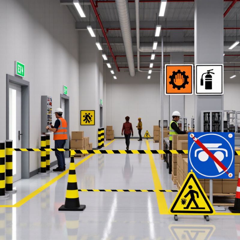
Workplace safety signs do more than decorate walls. They guide decisions when noise, pressure, or poor visibility affects attention. A clear warning sign can prevent a worker from entering a wet area, touching exposed equipment, or lifting a load incorrectly. Its purpose is immediate communication, not decoration.
Useful signs include warning, prohibition, mandatory personal protective equipment, emergency exit, first aid, fire equipment, electrical hazard, biohazard, slippery surface, and restricted access signs. Each one should match the real risk. For example, a wet-floor sign belongs beside the spill, not several meters away. An emergency exit sign must remain visible during smoke, darkness, or a power failure. Color, shape, wording, and symbols should stay consistent across the workplace.
Details matter. Place signs at eye level near entrances, machines, stairways, and chemical storage areas. Use plain language and strong contrast.
Keep signs clean, undamaged, and visible from normal walking distance. Supervisors should inspect them during routine safety checks and replace faded signs quickly.
Training also matters because a symbol may not mean the same thing to every worker. A sign cannot replace risk assessments or practical instruction.
I have seen well-designed signs ignored when too many covered the same wall. That is a useful warning itself. Even a correct sign can fail when placement, lighting, or worker understanding is overlooked.
10 Best Safety Signs for Every Workplace?
Safety signs communicate quickly when noise, stress, or poor lighting affects attention. Their colors provide the first visual clue. Red commonly signals prohibition, danger, or firefighting equipment. A red circle with a diagonal bar means an action is forbidden, such as smoking. A red rectangle may identify an extinguisher or alarm point.
Yellow usually marks warnings about hazards, including wet floors, moving machinery, or exposed edges. Its triangular shape strengthens the message: slow down and assess the danger. Blue signs normally indicate mandatory actions. A blue circle showing ear protection means workers must wear it in that area. These signs work best when placed before the hazard, not beside it.
Green represents safe conditions and emergency guidance. A green square or rectangle can mark an exit, first-aid station, or assembly direction. Shape matters because people may recognize it before reading words. During workplace inspections, I check whether signs remain visible from normal walking distances. Dust, glare, stacked materials, and faded colors can weaken a clear message. Small details matter.
Meaning can change across regions and industries, so site managers should confirm current workplace requirements. A sign can also be technically correct yet poorly understood. Test it with new workers. Their confusion reveals weaknesses experienced staff may overlook. Too many signs create visual clutter. Fewer, well-positioned signs often communicate better.
Classifying safety signs by color, shape, and meaning using common ANSI/ISO-style workplace conventions.
The chart groups ten widely used workplace sign examples by their primary color category. Red commonly indicates prohibition, danger, or fire equipment; yellow indicates caution; orange identifies machine or equipment hazards; blue communicates required actions or notices; and green identifies safe conditions, emergency exits, or first-aid facilities. Circles commonly indicate prohibitions or mandatory actions, triangles indicate warnings, and rectangles or squares provide equipment, instruction, or safe-condition information.
Safety signs work best when they match real hazards, not decoration. A mandatory PPE sign should mark entrances to workshops, showing eye, hand, or foot protection clearly. Wet floor signs belong beside fresh spills, not across the room. High-voltage warnings should appear on electrical cabinets and locked service areas. Fire extinguisher signs must remain visible above equipment, even when storage changes.
Emergency exit signs guide people through smoke, darkness, or crowded corridors. First aid signs should point toward stocked kits and trained responders. Forklift route signs help separate pedestrians from moving vehicles, especially near blind corners. No smoking or open-flame signs matter around fuel, dust, and flammable chemicals. Chemical hazard signs should identify restricted areas and support correct handling procedures. Hearing protection signs belong near loud machinery, where conversations become difficult.
Keep signs clean and readable. Replace faded labels quickly. Small details matter.
From workplace inspections, I have seen signs fail because shelves block them or workers stop noticing familiar symbols. That is an uncomfortable lesson. A sign cannot repair poor training, missing guards, or careless supervision. Place it at eye level, use plain wording, and check whether workers understand it during routine drills. A quick employee question can reveal confusion before an incident does.
Choosing the Right Safety Signs for Different Work Environments
The best safety sign depends on the hazard, location, and worker’s decision time. A warehouse needs danger, warning, forklift route, and mandatory PPE signs near loading areas. A construction site may require chemical hazard, falling-object, restricted-entry, and high-voltage warnings. Use clear words, strong contrast, and familiar symbols. ANSI Z535 guidance recommends consistent signal words, such as Danger, Warning, and Caution, to communicate risk levels.
Manufacturing floors often need machine-guarding, emergency-stop, eye-protection, and hearing-protection signs. Wet-floor signs belong beside spills, not several meters away. In offices, emergency exit, first-aid, fire-equipment, and evacuation signs should remain visible during smoke or power loss. The U.S. Bureau of Labor Statistics recorded 5,283 workplace deaths in 2023. That figure supports practical sign placement, but signs cannot replace training or maintenance.
The UK Health and Safety Executive reported 1.7 million workers with work-related ill health in 2023/24. Some signs should therefore address quieter risks, including noise, respiratory exposure, and manual handling. Inspectors should check faded ink, blocked sightlines, and confusing messages every month. Real workplaces change. A sign that worked last year may now point toward the wrong route. Less clutter can improve attention, although removing a sign requires careful risk review. Safety teams should test signs with new workers, since experienced employees may overlook familiar hazards.
| No. | Safety Sign | Primary Workplace | Sign Type | Main Purpose | Recommended Placement | Key Design Features | Inspection Focus |
|---|---|---|---|---|---|---|---|
| 1 | Emergency Exit | All workplaces, offices, factories, warehouses, and public facilities | Safe-condition sign | Directs people toward a safe evacuation route during an emergency. | Above exit doors, at corridor junctions, and wherever the escape route changes direction. | Green background, white running-person or exit symbol, directional arrow, and strong visibility. | Confirm the route is unobstructed, illuminated, and visible from normal travel paths. |
| 2 | Fire Extinguisher | Offices, workshops, kitchens, warehouses, laboratories, and production areas | Fire-equipment sign | Identifies the location of portable fire-fighting equipment. | Directly above or immediately beside the extinguisher, where it can be seen from nearby access routes. | Red panel, white extinguisher symbol, clear text, and high contrast. | Check that the extinguisher is present, accessible, correctly mounted, and within its inspection period. |
| 3 | Personal Protective Equipment Required | Construction areas, manufacturing floors, laboratories, and maintenance zones | Mandatory-action sign | Reminds workers and visitors to wear specified protective equipment before entering or starting work. | At entrances, access gates, equipment cells, and task-specific hazard points. | Blue circular format with recognizable symbols for eye, hearing, head, hand, or foot protection. | Verify that the listed PPE matches the hazards and is available in usable condition. |
| 4 | Wet Floor | Kitchens, cleaning areas, entrances, washrooms, and food-processing facilities | Temporary warning sign | Warns people about a slip hazard caused by water, cleaning solution, or another liquid. | Immediately beside the affected area and at approaches from both directions. | Yellow warning color, black slipping-person symbol, and concise wording. | Remove the sign only after the surface is dry and the hazard has been controlled. |
| 5 | High Voltage | Electrical rooms, substations, switchboards, utility areas, and maintenance zones | Danger sign | Warns authorized personnel and others about the risk of electric shock or arc flash. | On electrical enclosures, doors, gates, panels, and approach barriers. | High-contrast black and yellow or black and orange layout with a lightning-bolt symbol. | Ensure the sign is legible, firmly attached, and located before the point of access. |
| 6 | No Smoking or Open Flames | Fuel-storage areas, chemical stores, laboratories, warehouses, and flammable-material zones | Prohibition sign | Prevents ignition sources where smoking, flames, or sparks could cause fire or explosion. | At entrances, perimeter boundaries, storage locations, and other points where the restriction begins. | Red circle and diagonal bar over a cigarette or flame symbol, with readable text where needed. | Check that the sign remains visible and reflects the current site rules and hazardous-material controls. |
| 7 | First Aid | Offices, workshops, construction sites, schools, warehouses, and field operations | Safe-condition sign | Shows the location of first-aid supplies, treatment rooms, or trained assistance. | Above first-aid cabinets, at treatment rooms, and along routes from high-risk work areas. | Green background with a clearly recognizable white cross or first-aid symbol. | Confirm supplies are stocked, accessible, and identified from a reasonable distance. |
| 8 | Forklift and Pedestrian Traffic | Warehouses, distribution centers, manufacturing plants, and loading areas | Warning and traffic-control sign | Separates vehicle routes from pedestrian routes and warns of moving industrial trucks. | At crossing points, aisle entrances, blind corners, loading docks, and shared traffic zones. | High-visibility colors, directional arrows, pedestrian and forklift symbols, and supplemental speed or crossing text. | Make sure signs are not blocked by stored materials, vehicles, or temporary equipment. |
| 9 | Confined Space—Authorized Entry Only | Tanks, silos, pits, manholes, utility chambers, and industrial maintenance areas | Danger and prohibition sign | Prevents unauthorized entry into spaces that may contain atmospheric, engulfment, or rescue hazards. | At every entrance, cover, hatch, ladder access point, and approach route. | Clear danger wording, confined-space symbol, and a statement restricting entry to trained and authorized personnel. | Check that the sign remains in place and that entry controls, permits, and rescue procedures are current. |
| 10 | Biohazard | Healthcare facilities, laboratories, clinical-waste areas, and biological research spaces | Hazard warning sign | Identifies areas, containers, or materials that may contain infectious biological agents. | On laboratory doors, specimen containers, waste containers, refrigerators, and controlled work areas. | Recognizable biohazard symbol with strong contrast and supplementary handling or access instructions. | Verify that the symbol is intact, the hazard classification is current, and access restrictions are followed. |
Effective safety signs do more than fill empty walls. They guide people toward exits, emergency equipment, restricted areas, wet floors, electrical hazards, and required protective equipment. During a site inspection, I look at visibility from normal walking routes, not just from the doorway. A sign hidden behind stacked cartons is not working. Neither is one placed above eye level in a crowded workshop.
Installation needs practical judgment. Mount signs at decision points, such as stair entrances, loading areas, and chemical storage doors. Use clear wording, strong contrast, and familiar symbols. Keep emergency signs visible during poor lighting or smoke conditions. A rushed installation can create confusion. I have seen two directional arrows pointing toward different exits, which required immediate correction.
Maintenance should include cleaning, checking faded colors, tightening loose mounts, and replacing cracked panels. Review signs after layout changes, new equipment, or an incident. Walk the area with workers and ask what they notice first. Their feedback often reveals problems managers miss. I also compare signs with current workplace procedures and training materials. A review every few months is useful, but it should not replace daily awareness. Some signs remain technically present yet become background noise, and that weakness deserves honest attention.
Red usually signals danger, prohibition, or firefighting equipment. Yellow warns about hazards. Blue requires an action, such as wearing ear protection. Green shows exits, first-aid points, or safe routes.
Shapes help people recognize meaning before reading words. A red circle with a diagonal bar shows prohibition. A yellow triangle signals caution. A green rectangle may mark an emergency exit.
Place signs before people reach the hazard. Install them at stair entrances, loading areas, and storage doors. A wet-floor sign belongs beside the spill. Not several meters away.
Warehouses may need route, warning, danger, and protective-equipment signs. Workshops often need machine-guarding, emergency-stop, eye-protection, and hearing-protection signs. Keep them visible from normal walking paths.
Mark exits, first-aid stations, fire equipment, and evacuation routes clearly. Signs should remain visible during smoke or power loss. Keep them away from cabinets, cartons, and decorative displays.
Check signs during daily awareness and formal inspections every few months. Clean dusty surfaces, replace faded colors, and tighten loose mounts. Review signs after layout changes, new equipment, or incidents.
Yes. Too many signs create visual clutter and weaken attention. Fewer, well-positioned signs often work better. Removing one still requires careful risk review.
Ask new workers what they notice first and what action they would take. Their confusion can reveal hidden weaknesses. Experienced workers may overlook familiar hazards. I would not assume a technically correct sign is automatically clear.
Workplace Safety Signs play a vital role in preventing accidents, guiding employees, and communicating important information quickly. This article explains how signs identify hazards, indicate required actions, mark emergency equipment, and support safer daily routines. It also explores how colors, shapes, symbols, and wording work together to convey meanings such as warnings, prohibitions, mandatory instructions, and emergency directions. Understanding these visual features helps employees recognize risks even in busy or unfamiliar areas.
The article highlights ten essential signs for common workplace hazards, including slippery surfaces, fire equipment, electrical dangers, protective equipment requirements, restricted access, and emergency exits. It also discusses how to choose signs according to the environment, audience, lighting, and specific risks. Finally, the guide emphasizes correct installation, clear visibility, regular cleaning, timely replacement, and periodic reviews so signs remain accurate, readable, and useful as workplace conditions change.